Project Details
Gummi.fi • Basdaq Terminal
A widespread, cross-functional project that brought the flagship Gummi product to market and into user hands. My role as founding designer was to help define the product requirements, design all user flows and interactions and to be on top of user research and feedback and respond appropriately as part of on-going development of the Gummi products.
About
Gummi
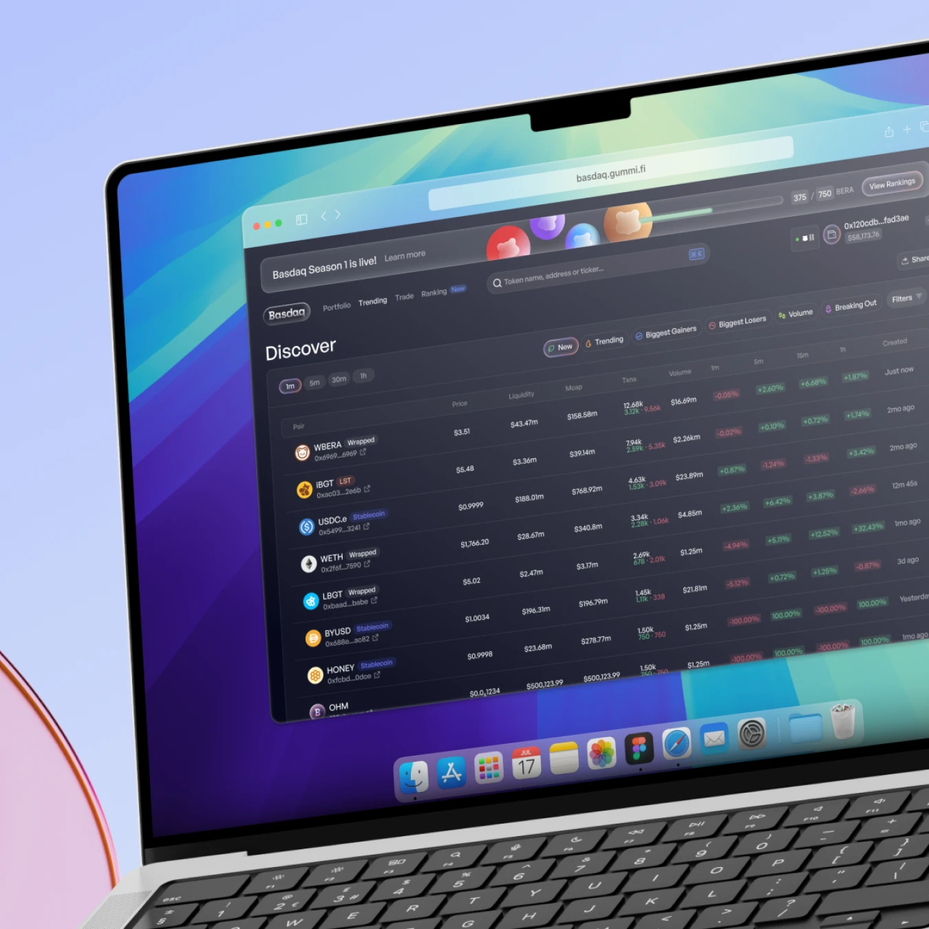
Gummi is a DeFi platform and trade terminal targeting traders looking for opportunities in the Berachain ecosystem. Built to make token discovery and high speed position entry and exit highly optimised.
Project
Objectives
Define requirements and design for two Gummi products
Maintain and identify features for live platforms
Conduct user research and feedback capture
Manage design → development pipeline & cross-functional relationships
Process &
Approach
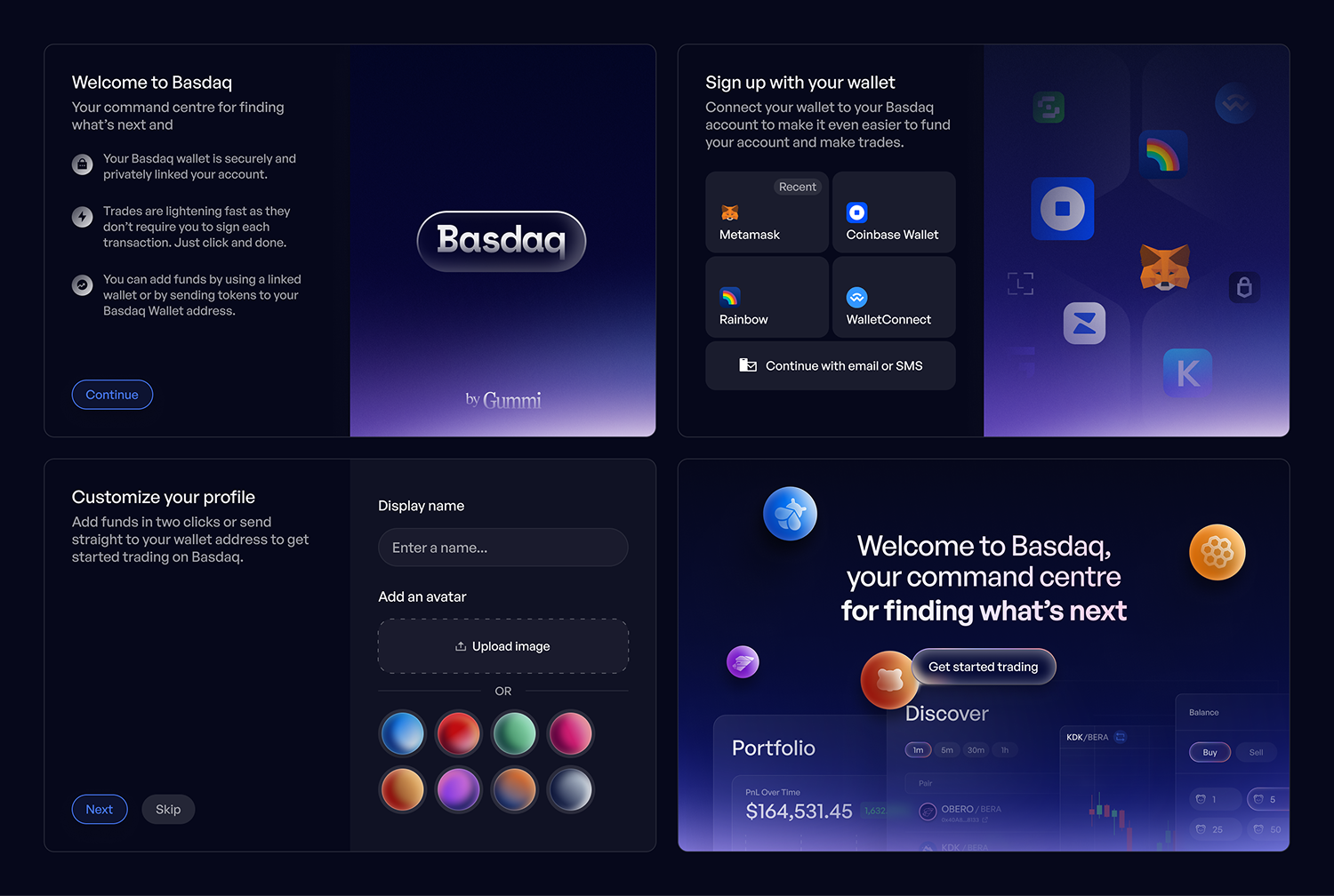
Streamlined onboarding
Onboarding often creates friction in DeFi. We simplified entry by reducing unnecessary steps and guiding users through just what’s needed.
The result was faster access to the product, less confusion and more users being converted from social and mail campaigns
Data at hand
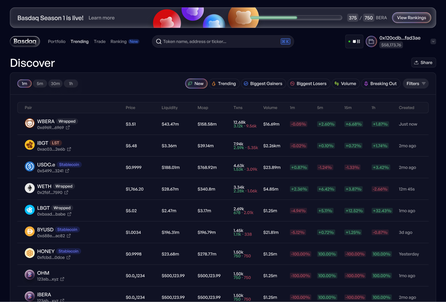
We wanted to allow users a clear, data rich view of assets on Berachain, without too much noise.
We designed the Discover page to surface Berachain tokens and key metrics in a clean, sortable table. Ensuring that users scanning for opportunities or researching a specific token, always had the info in reach.
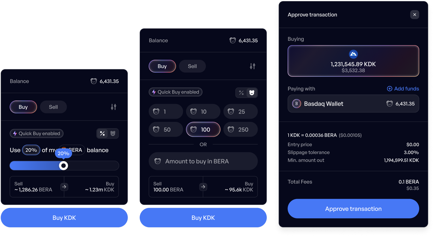
Trading at speed and with flexibility
We built trading interactions that feel immediate and intuitive.
Signless buys, adjustable inputs via sliders or manual values, whatever the user style, it’s fast and easy. Ultimately leading to less faffing around, and more trades getting done.
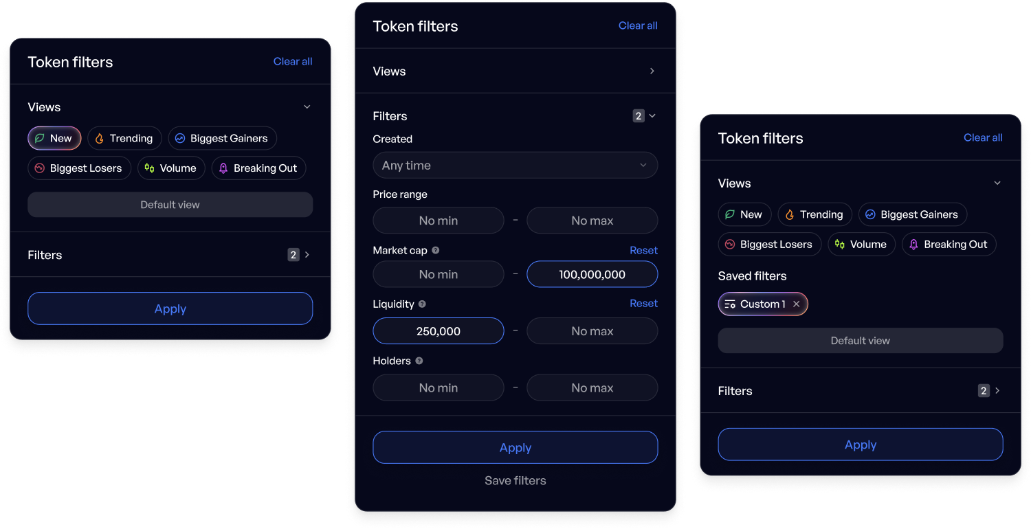
Smart filtering and manual control
We designed a system to quickly apply intelligent filters, surfacing trending and high-impact tokens in one click, while also providing manual controls for deeper dives.
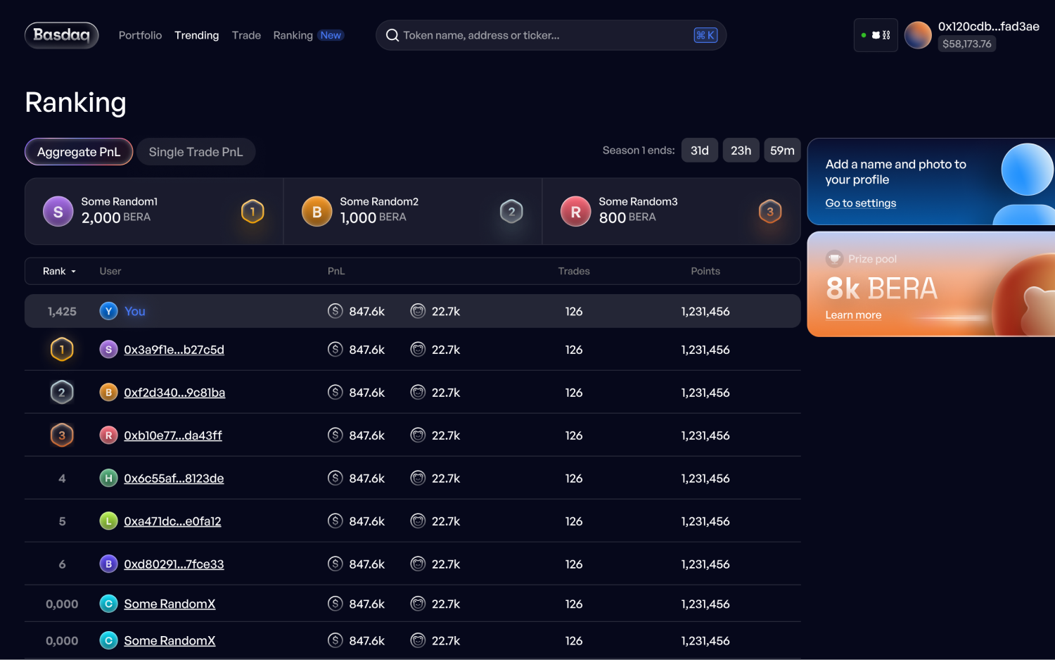
Design language that can scale
The leaderboard was a good excuse to push the design system further. From typography to layout, it all flexes to accommodate data-heavy views while still feeling slick and cohesive.
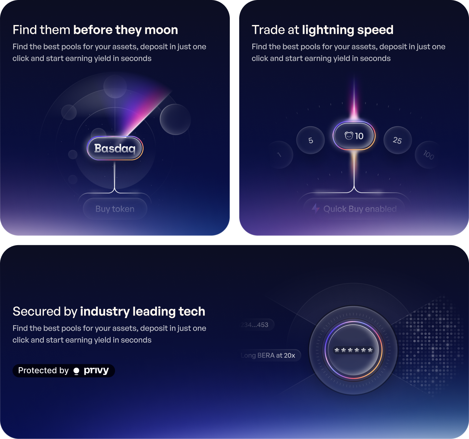
Building out the rest of the brand touchpoints
We extended the brand with a unified look across a website and content project.
This exercise included bespoke illustrations, secondary visual language, motion and tonal copy. By using light, texture, and shape, the visuals elevate the product’s modern, polished identity without overcomplicating the experience.
Consistency doesn’t mean rigidity. Our visual language adapts well to other touchpoints including social and email. We kept things bold, recognisable, and engaging no matter the format. It makes sure every interaction feels like a piece of the bigger whole.
Check out
what's up next


Contacting me
Get in touch and let's chat
If you have a project, role or other opportunity in mind, drop me a message.